

If you want to go beyond the built-in customization options and have full control over the look and feel of your homepage header, FeatureOS lets you write custom CSS directly from your organization settings. This is ideal for teams who want pixel-perfect branding with custom colors, fonts, spacing, backgrounds, and more.
Using theme presets
If you're not sure where to start, FeatureOS comes with six built-in theme presets you can load as a starting point. Click the Themes button at the top of the editor to see the available options.
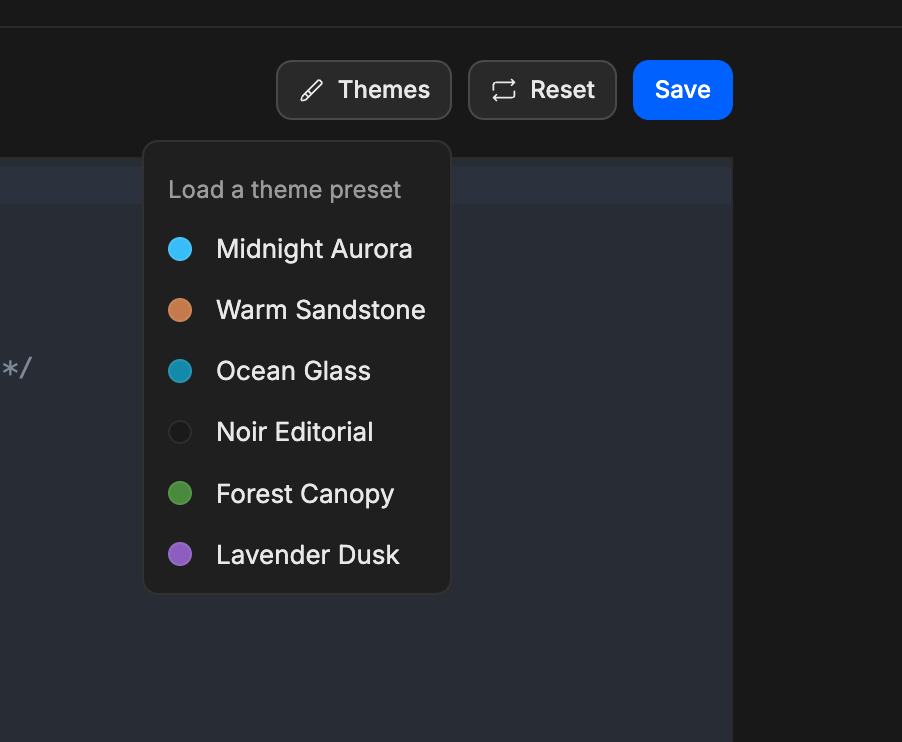
Selecting a preset loads its CSS into the editor. You can use it as-is or modify it to suit your brand. This is a great way to get a feel for how the CSS is structured before writing your own.
Resetting your CSS
If you want to start fresh, click Reset to clear the editor and remove any custom styles currently applied. Note that this cannot be undone, so make sure to copy your CSS somewhere safe before resetting if you might want to reuse it later.
Class name reference
Below is a full list of all the CSS classes available for customization, grouped by the part of the header they control.
1. Background & layout
These classes control the overall page background and the main content containers across different page types.
Class | What it controls |
|---|---|
| The fixed full-page background layer, sits behind all content |
| The content container on individual post pages |
| The content container on the Roadmap page |
| The content container on the Changelog page |
2. Header structure
These are the core building blocks of the header itself. Use these to control layout, background, spacing, and overall appearance of the header and its sections.
Class | What it controls |
|---|---|
| The main wrapper for the entire header component |
| The primary navigation area container |
| The container holding the Boards, Roadmap, and Changelog nav buttons |
| Individual navigation links (14px font size by default) |
| The container holding your logo and user action buttons |
| The clickable wrapper around your logo |
| The logo image element itself |
| The fallback text shown when no logo image is uploaded |
| The container for login/auth buttons and the mobile menu |
3. Banner
These classes control the full-width banner section that appears beneath the header navigation.
Class | What it controls |
|---|---|
| The main banner container |
| The content wrapper inside the banner |
| The main banner heading (white, 4rem, bold, Oswald font by default) |
| The subtitle text beneath the banner title |
| Large title text used in banner sections |
| Subtitle text used in banner sections |
4. Navigation dropdown for Boards
These classes control the Boards dropdown that appears in your header navigation.
Class | What it controls |
|---|---|
| The outer container for the Boards dropdown |
| The button that opens the Boards dropdown |
| The navigation link for Boards |
| The icon inside the Boards dropdown trigger |
| The dropdown menu itself |
| Individual board items listed in the dropdown |
| Section labels within the dropdown |
5. Navigation dropdown for Custom links
These classes control the dropdown that appears for any custom navigation links you've added.
Class | What it controls |
|---|---|
| The outer container for the custom links dropdown |
| The button that opens the custom links dropdown |
| The icon inside the custom links dropdown trigger |
| The dropdown menu itself |
| Individual link items listed in the dropdown |
6. Mobile menu
These classes control the mobile navigation experience — the hamburger button, sliding menu, and overlay.
Class | What it controls |
|---|---|
| The container for the hamburger menu button |
| The hamburger toggle button itself |
| The icon inside the hamburger button |
| The background overlay behind the open mobile menu |
| The sliding mobile menu panel |
| The content area inside the mobile menu |
| The close (X) button inside the mobile menu |
| The X icon inside the close button |
7. Styling for dark mode
FeatureOS supports dark mode, and you can write separate styles for it using .dark as a parent selector. This ensures your customizations look great in both light and dark contexts.
Any rule prefixed with
.darkwill only apply when a visitor has dark mode active.
Pricing
Need more help?
Reach out to our support at [email protected] or submit a request on our support board! 😃
Was this helpful?